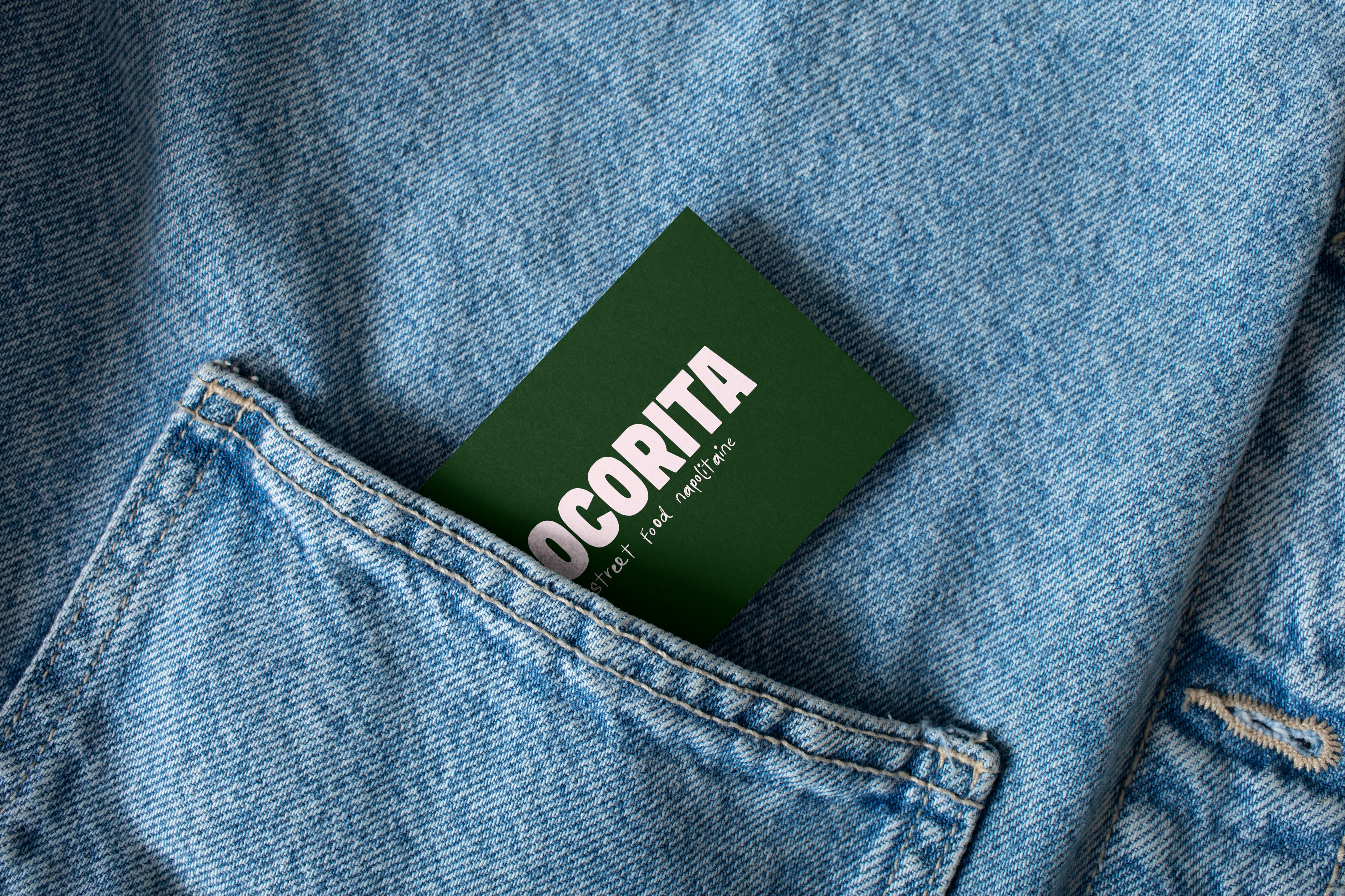
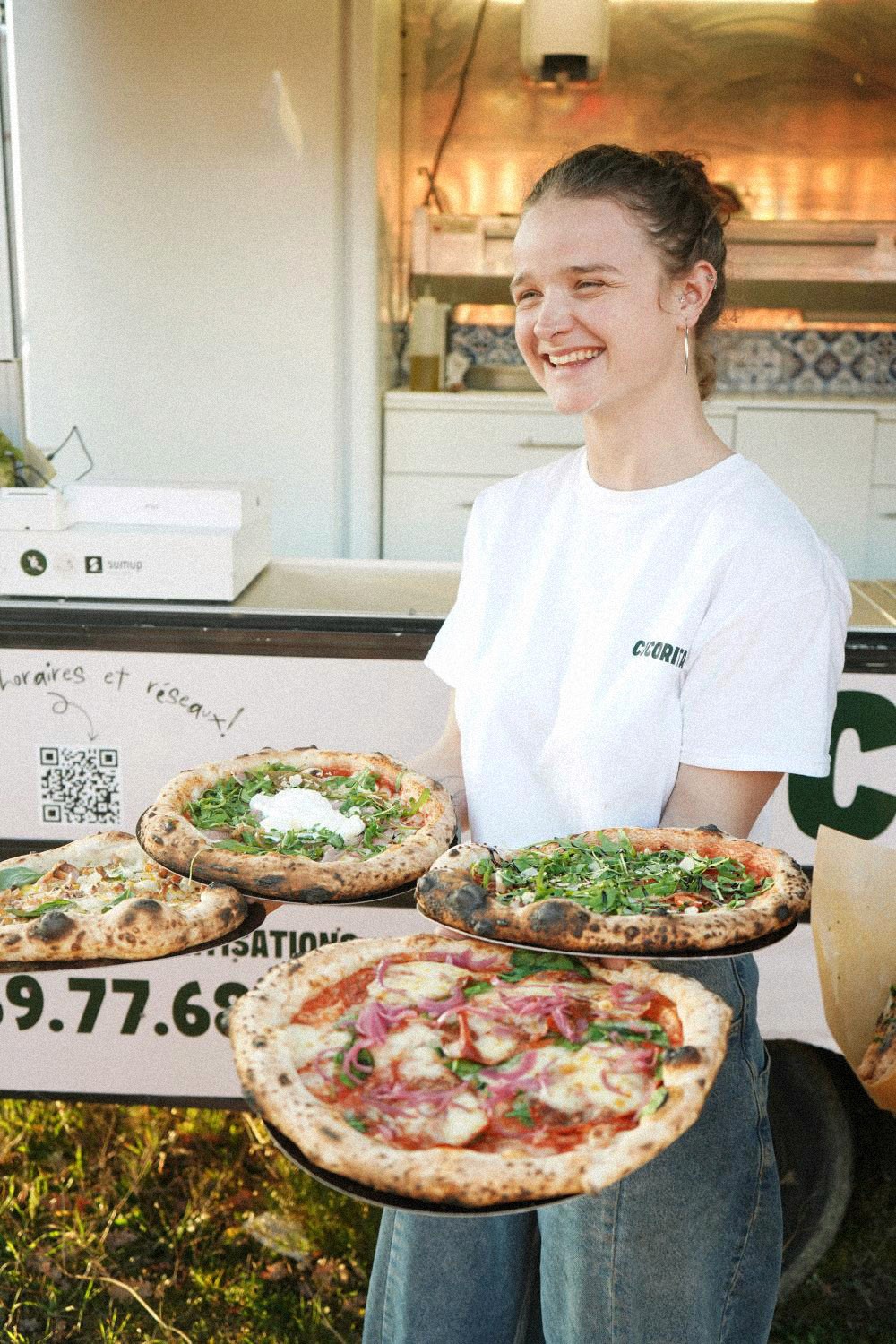
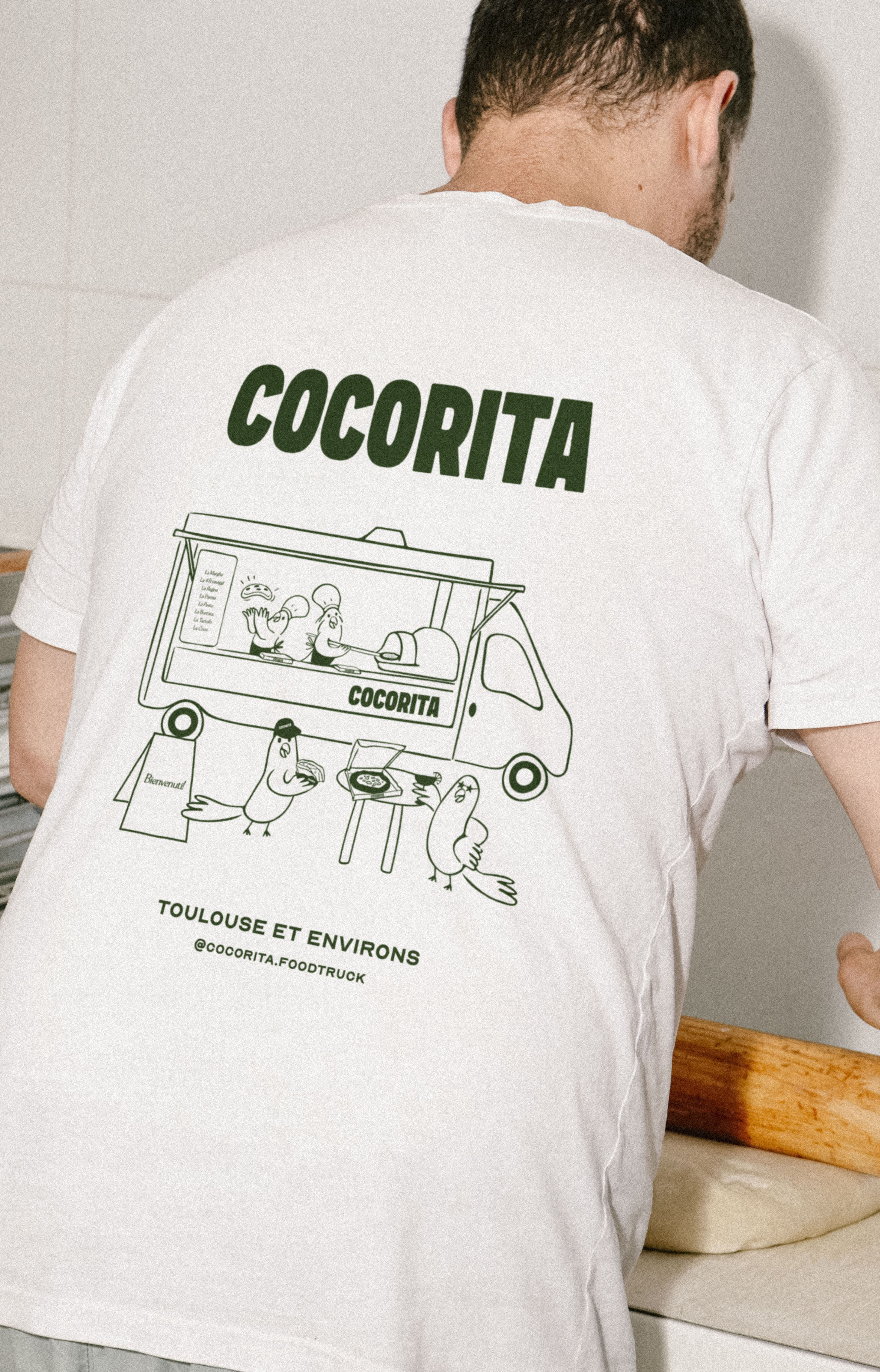
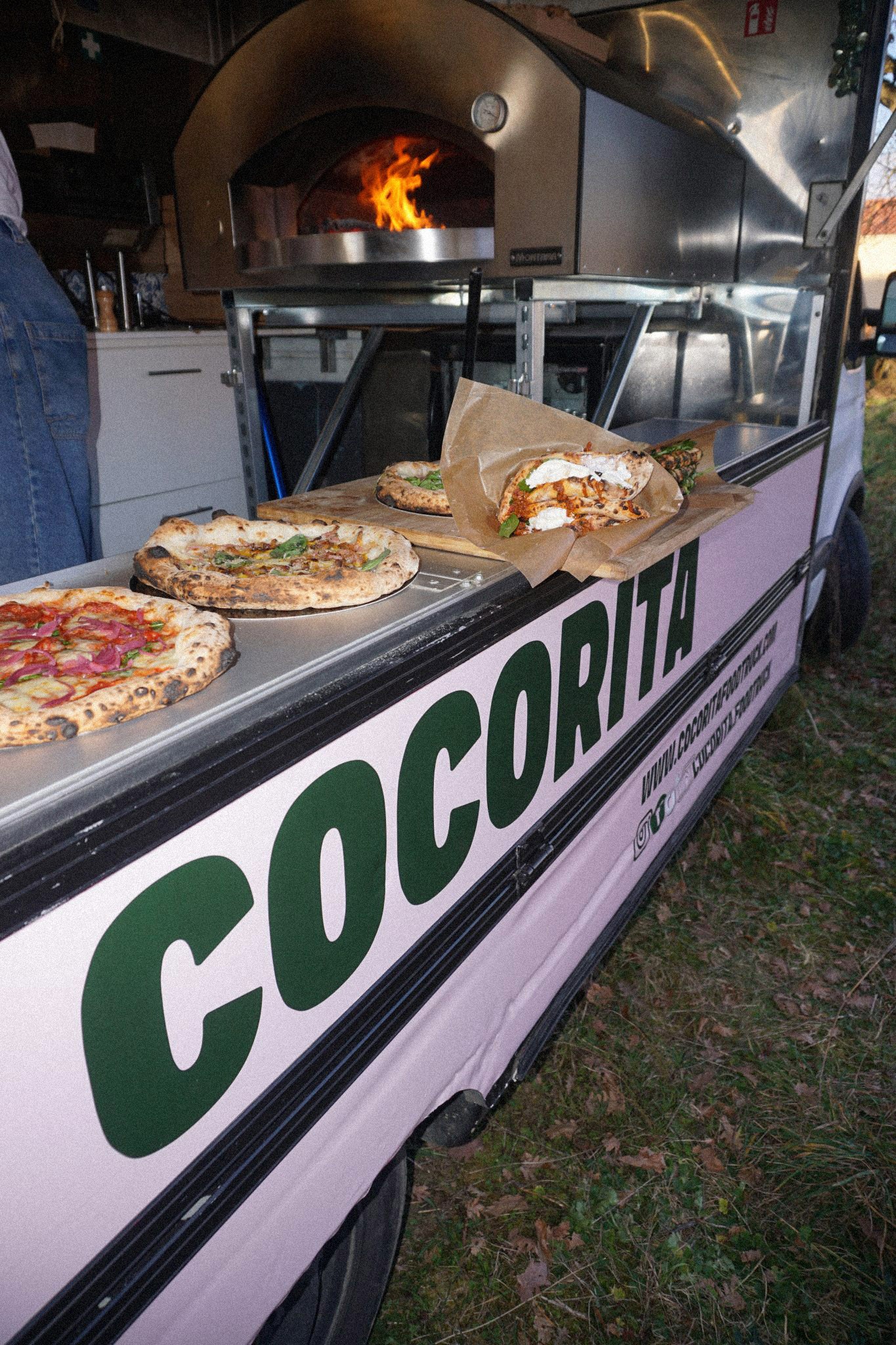
Cocorita is more than just a business project, it's above all a family affair. Martin and Annelie, the founders, are siblings. Their aim is to offer a warm and friendly culinary experience typical of the cuisine of Naples, while bringing the energy and modernity of a foodtruck.The challenge was to make the brand stand out from the saturated market of italian restaurants and highlight family values, while being fun and approachable.The identity catches the eyes with its original colors, as pink reflects the city of Toulouse nicknamed the “Pink City “ and green, for Italy.For the logo, the choice of a thick, sans-serif capital lettering makes the brand name legible and visible from a distance, a statement designed for a foodtruck.We decided to highlight the family with illustrations of personified parakeets, as the name of the founders is « Perruchoud » (“Perruche” means parakeet in french and the meaning of "COCORITA" is “parakeet" in italian.). On the main illustration, the siblings are illustrated inside the foodtruck cooking pizzas, surrounded with friends, family and customers, highlighting the warmth and communal spirit at the heart of Cocorita.